Responsibilities
User Interviews
Research Synthesis
Personas
Sketches
Wireframes
Prototype
Team
Jho, Jojo, and Shirley
Timeline
3 weeks
Client Project Goals
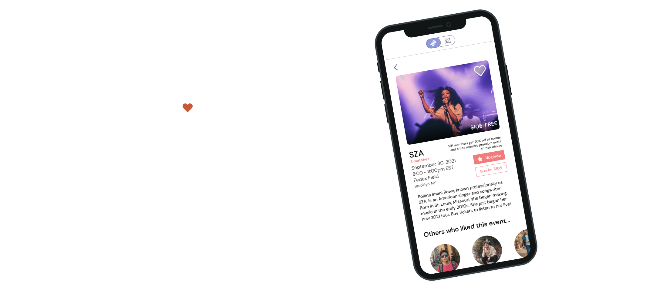
Swoonbox is an event based dating app that connects users based on their mutual event interests.
Cater to the single-female experience: the transactional nature of ticket purchases can lead to misbehavior and overall a negative experience.
Rebrand as a club / membership instead of a dating app: Expand the reach of their product.
Modernize the app: the current standing UX was developed in 2018 and they would like to update to meet current trends and design.
Problem
Users want a new and safe way to meet people who share similar interests, without feeling the social expectations that come with online dating
When the COVID-19 outbreak occurred, Swoonbox was forced to take a brief hiatus. With businesses slowly opening up, and events making a comeback, users are eager to go out again.
Solution
Swoonbox allows users to develop authentic connections through similar interests and moves the conversation from an online app to an in-person event

Interviews
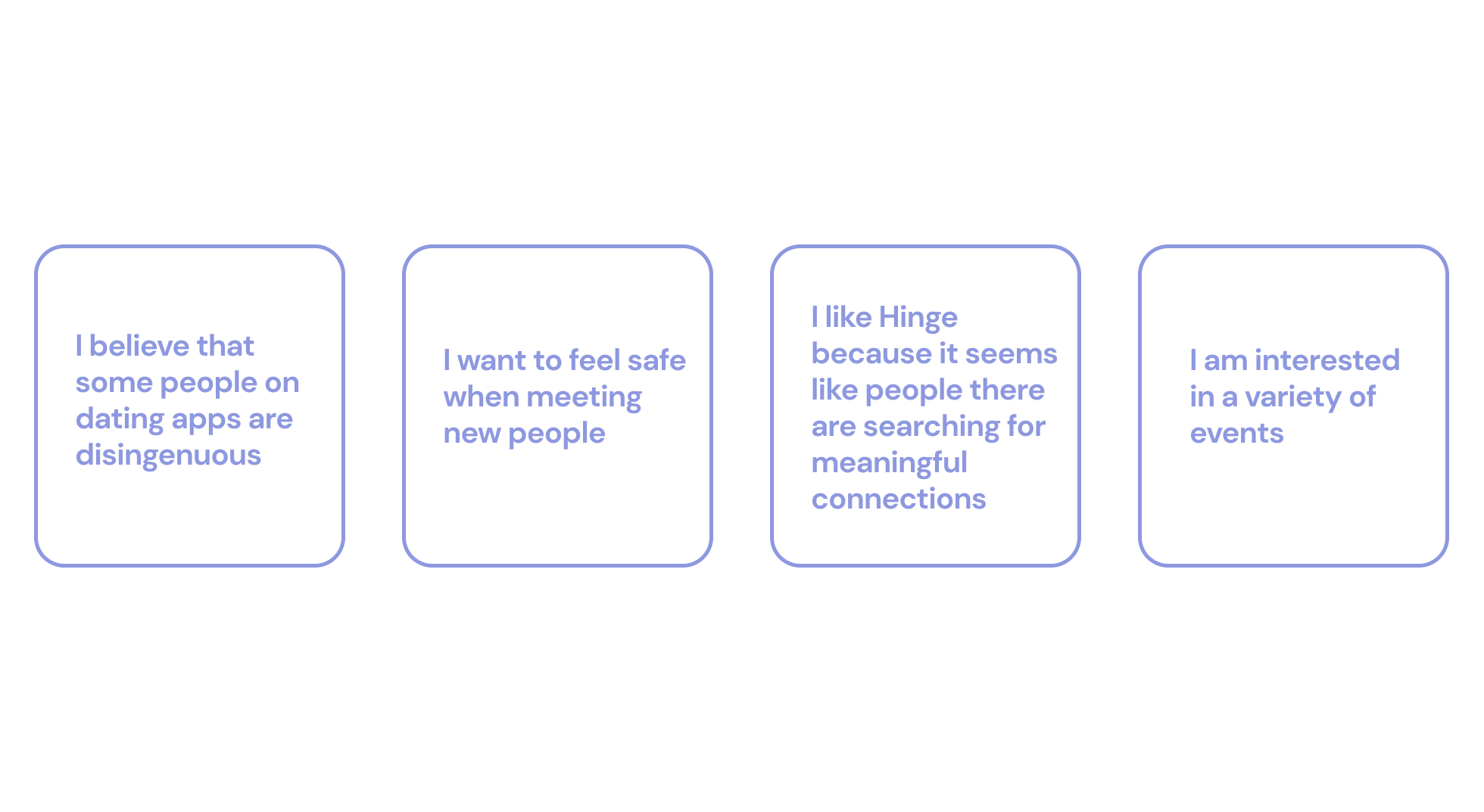
Users want to build a meaningful connection, and females especially want to feel safe when meeting new people
We conducted a total of 15 interviews to get a better understanding of who our users are. We made it a priority to find users who fall within the following categories:
Single females, currently using a dating app
Single females, who have used dating apps in the past
Anyone currently using or has used dating apps
Personas
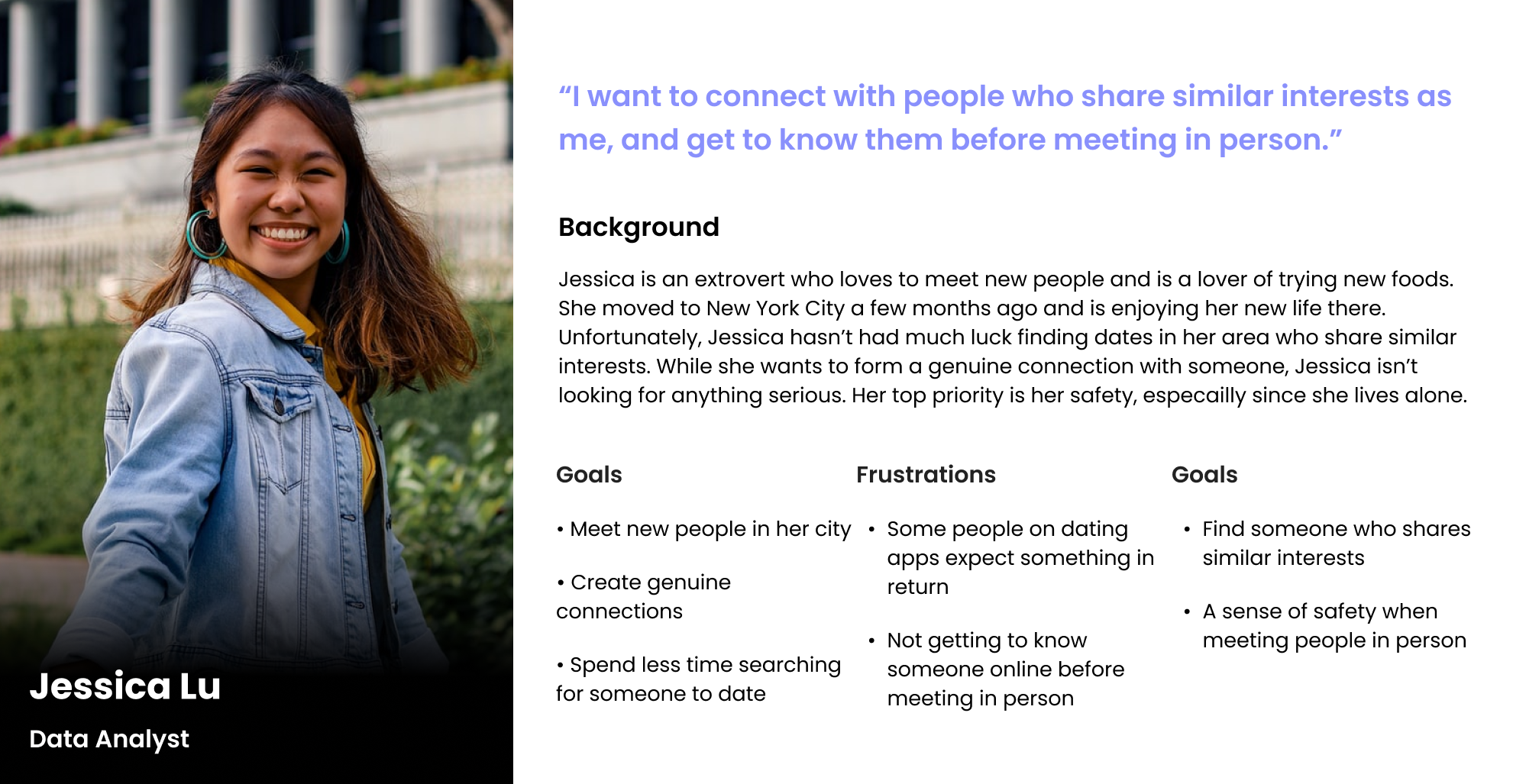
Jessica is new to the city and wants to find someone in her area who shares similar interests
We created two personas based on our research synthesis. Jessica Lu is our primary persona and represents the single female Swoonbox is hoping to reach and build a positive experience for.
Competitive Analysis
Swoonbox is both a dating app a AND a ticket provider
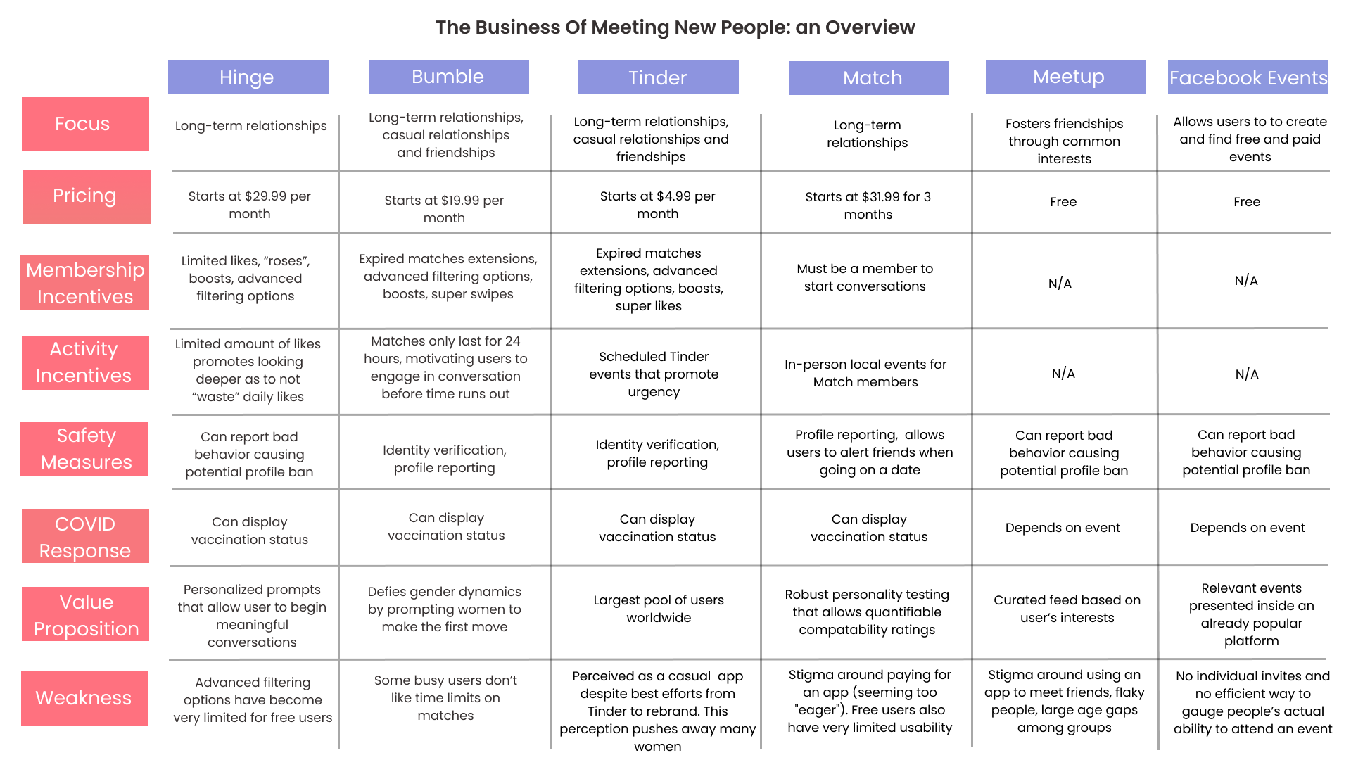
With Swoonbox’s shift from a typical dating app to an event membership club, we did extensive research on both competitor dating apps and ticket providers. We took a deep dive into what services our competitors were providing, and how we can integrate features onto our own app.
Sketches
A design studio to address the flows of a new membership model
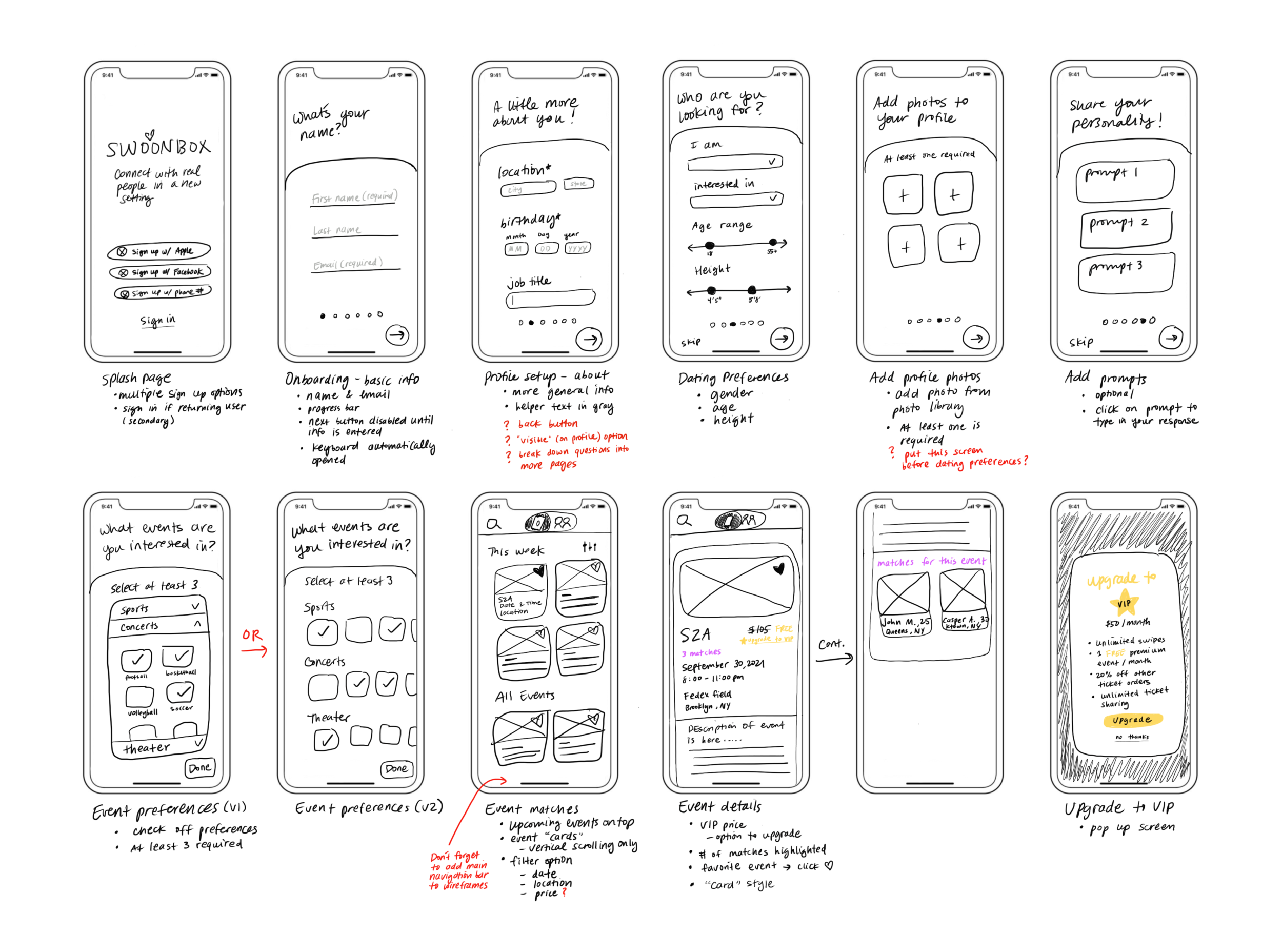
Before we began sketching, we took some time to review the previous prototype that was designed in 2018. The previous design was heavily focused on the on-boarding flow, so we brainstormed flows that would address the new membership model the app is introducing.
Flows: on-boarding, event discovery, and VIP membership upgrade
Wireframes
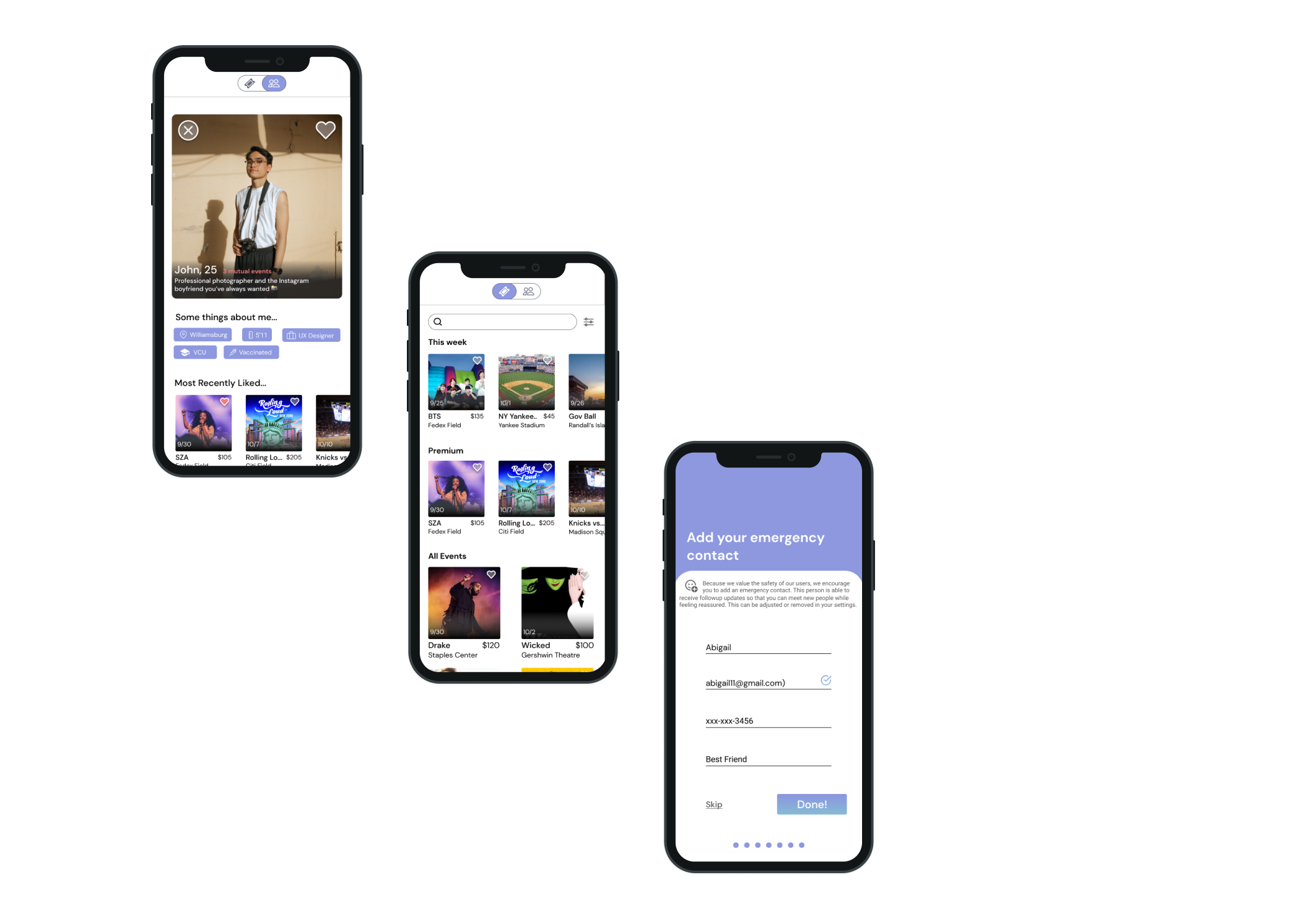
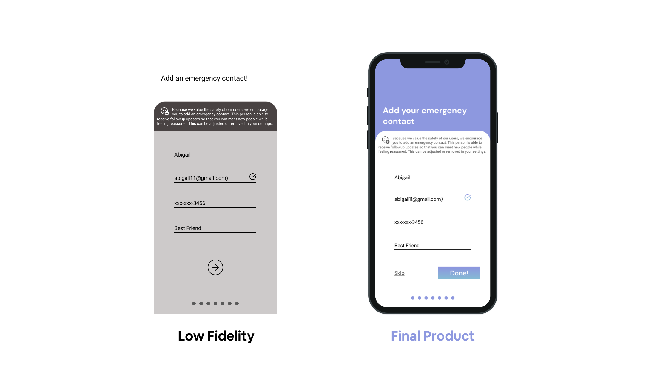
Users can now add an emergency contact to increase safety measures
Before focusing on visual design, we built out a low fidelity prototype to see if our designs were even successful. Would users find it intuitive? Are we addressing our users' pain points?
We particularly wanted to focus on safety, because it was one of our user’s main concerns. To address this, we created an option to add an emergency contact.
Usability Testing
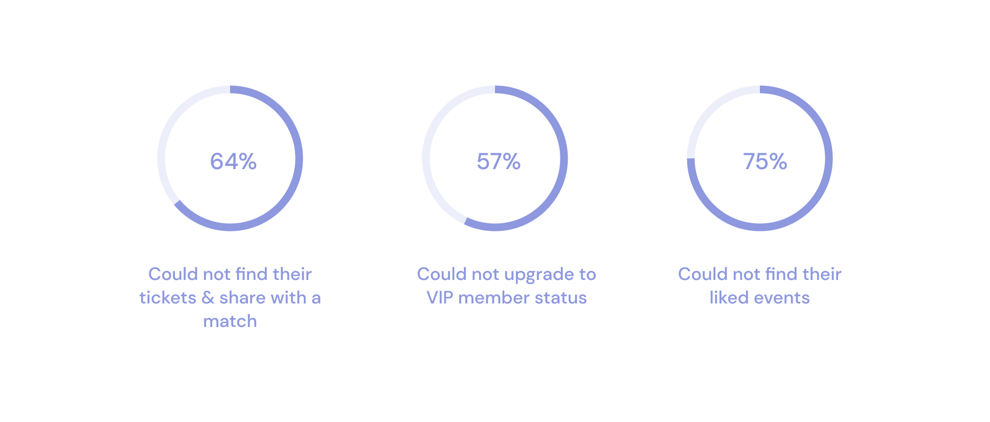
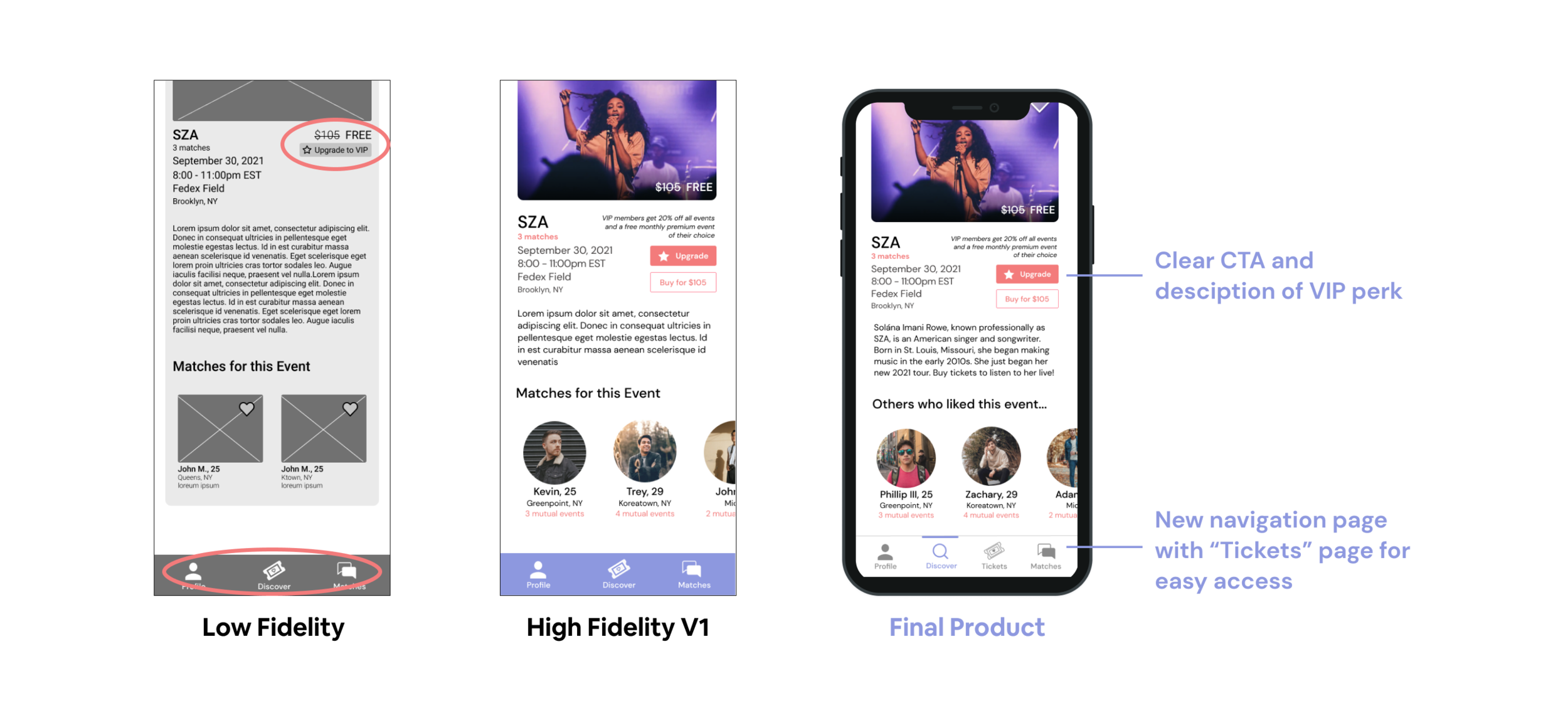
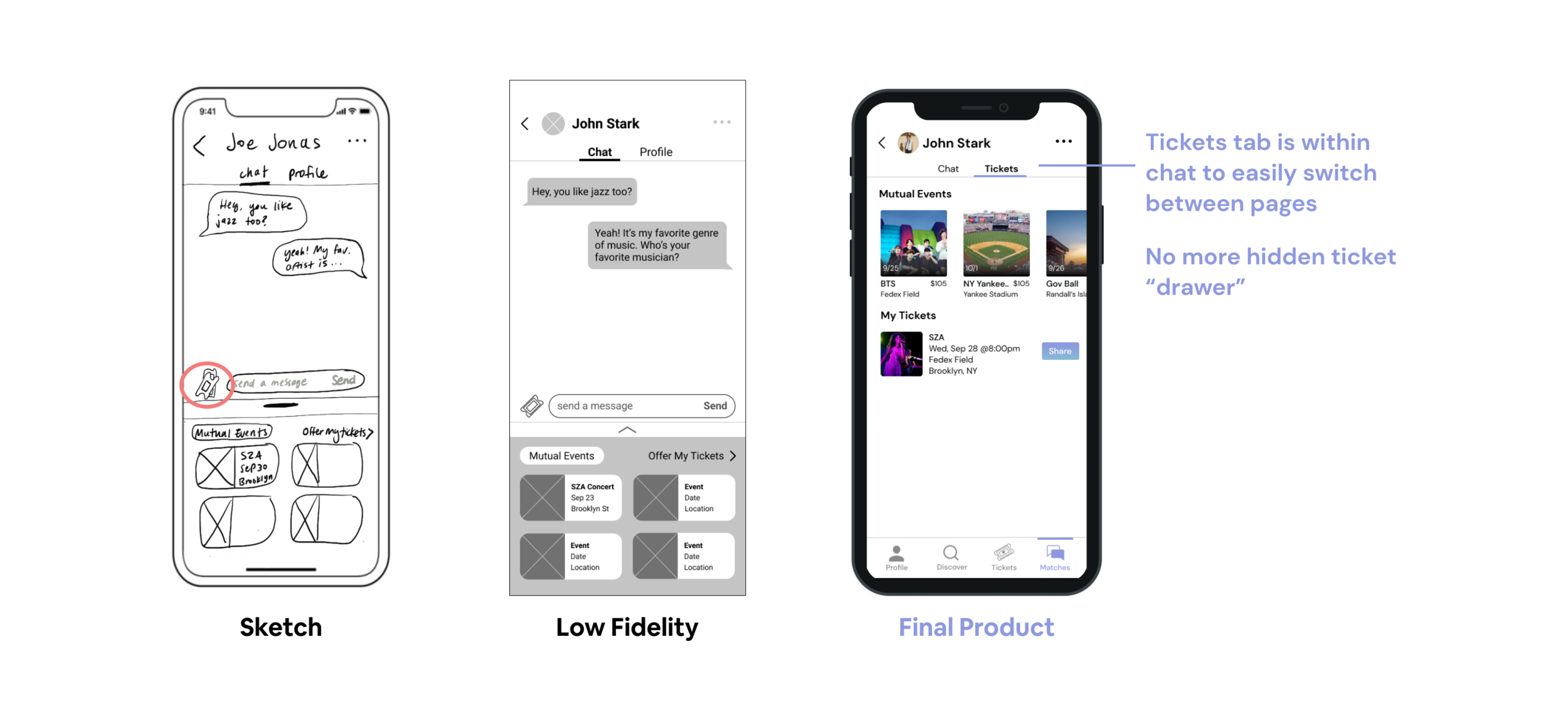
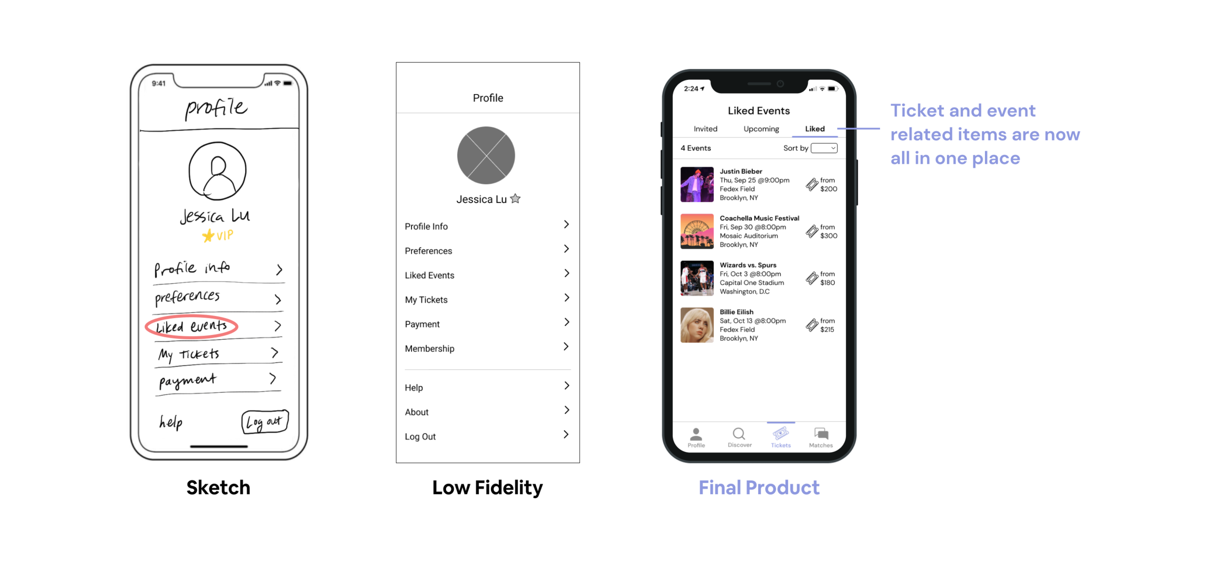
Users struggled to share their ticket with a match and locate their liked events
We conducted 2 rounds of usability testing. Our first round was for our low fidelity and the second round for the high fidelity.
Design Iterations
Improving the main navigation, ticket sharing, and liked events
Based off of the usability testing feedback we received, we made multiple changes to address the user’s frustrations with our app.

Next Steps
How to continue Swoonbox
How will users communicate with their emergency contact when on a date?
More research would need to be done on the emergency contact feature to figure out how this would come into play during a real date. Some possibilities we have explored: users sending text updates to their emergency contact throughout the date or sharing your location.
How can we make sure users actually show up to events that they’re invited to?
Nobody likes to be stood up, especially if it’s a first date… How can we encourage users to show up?
